
Many Pakistani businesses ask for a logo with “everything” in it: a building, a globe, three colours, a tagline and a shadow. The result looks busy, prints badly and disappears on a phone screen. That is why more brands are now asking for minimalist logo design.
In this guide, we explain what a minimalist logo is, why it works so well in 2026, and how to create one for your business. You will also see practical ideas for restaurants, clothing brands, clinics and tech startups in Pakistan.
Table of Contents
- What Is Minimalist Logo Design?
- Why Minimalist Logo Design Works So Well
- Key Elements of a Minimalist Logo
- Minimalist Logo Ideas by Industry
- How to Create a Minimalist Logo: Step by Step
- Common Minimalist Logo Mistakes
- Can You Use AI or Canva for a Minimalist Logo?
- Fonts for Minimalist Logo Design
- Negative Space in Minimalist Logo Design
- Minimalist Logos and Urdu Lettering
- Minimalist Logo Design Process at SuperioTech
- Keeping Minimalist Logo Design Consistent
- Minimalist Logo Design Checklist
- Conclusion
What Is Minimalist Logo Design?
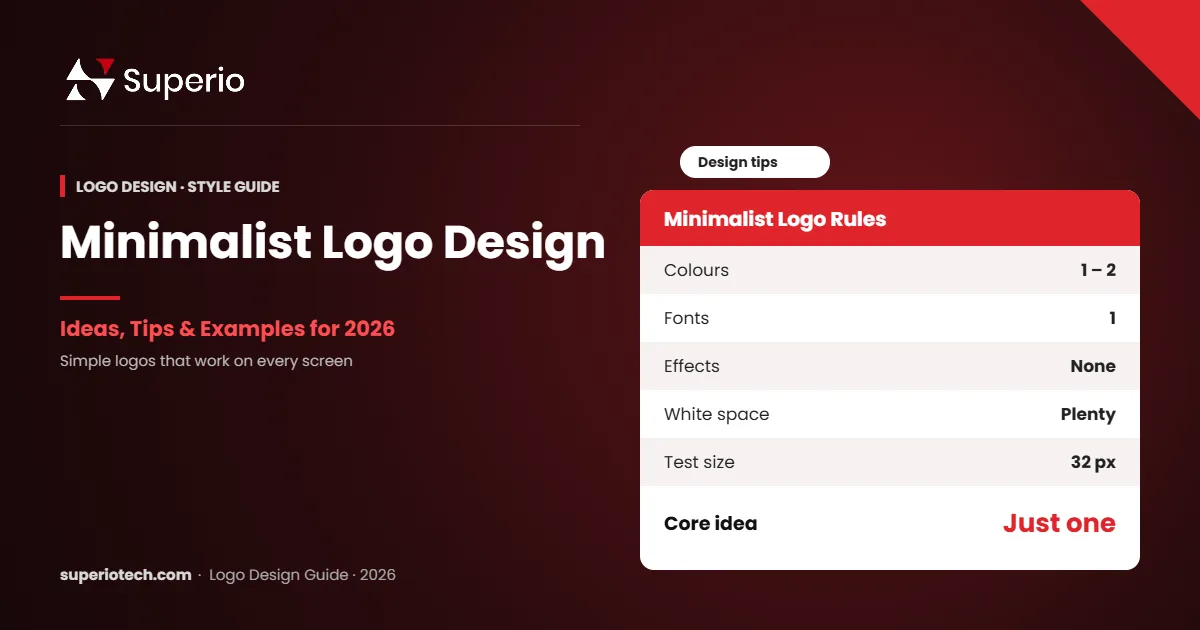
Minimalist logo design is a style that uses only the essential elements: simple shapes, clean fonts, one or two colours and plenty of empty space. The goal is a logo that is easy to recognise in a second and works at any size, from a tiny app icon to a large signboard.
In simple words, a minimalist logo removes everything that does not need to be there.
“Perfection is achieved, not when there is nothing more to add, but when there is nothing left to take away.” — Antoine de Saint-Exupéry
Why Minimalist Logo Design Works So Well
1. Easy to Remember
The brain remembers simple shapes faster than complex pictures. So, customers recall your brand more easily.
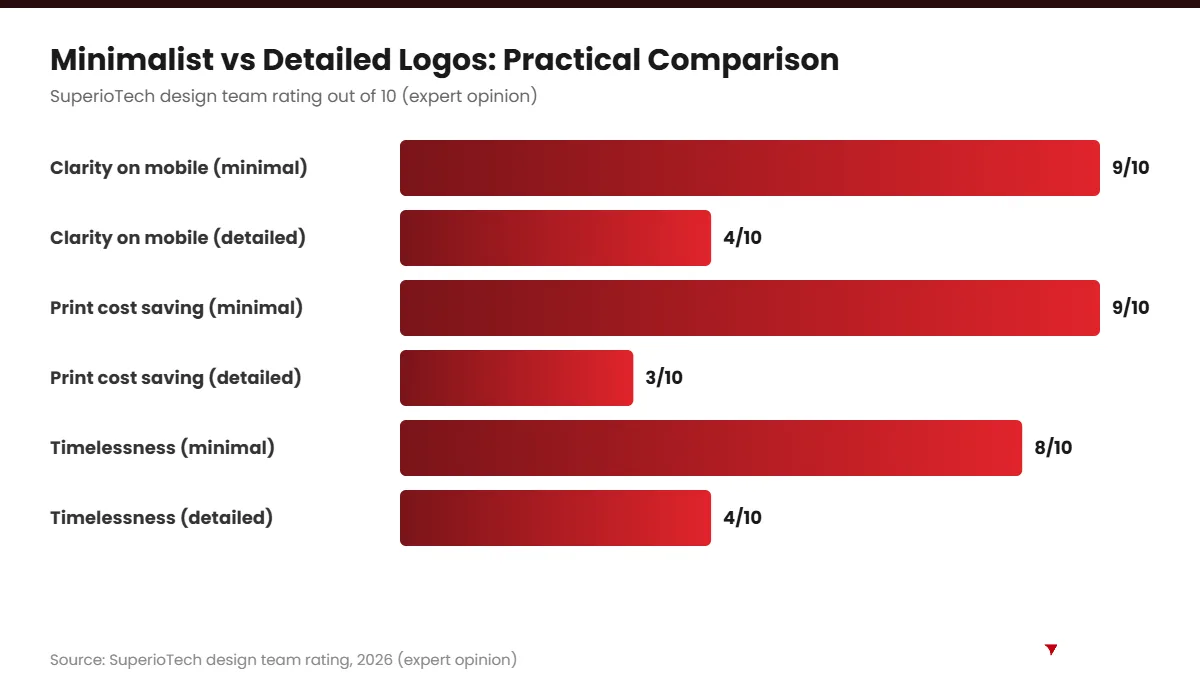
2. Perfect for Mobile Screens
Most people in Pakistan browse on phones. Therefore, your logo often appears very small, in a profile circle or browser tab. Simple logos stay clear at these sizes.
3. Cheaper to Print and Produce
Fewer colours mean lower costs for printing, embroidery, stamps and packaging. For example, a one-colour logo is much cheaper to embroider on staff uniforms.
4. Timeless
Trendy effects such as gradients and 3D shadows go out of style. Simple logos, on the other hand, can last for decades with small updates.
5. Looks Premium
Many luxury and tech brands use clean, simple logos. As a result, minimalism signals quality and confidence.
Key Elements of a Minimalist Logo
| Element | Minimalist approach | Avoid |
|---|---|---|
| Shapes | Simple geometric forms | Detailed illustrations |
| Colours | One or two colours | Rainbow palettes |
| Fonts | One clean font | Mixing three or more fonts |
| Effects | Flat design | Shadows, bevels, glows |
| Space | Generous white space | Crowded layouts |
| Tagline | Separate from the logo | Tiny text inside the mark |
Minimalist Logo Ideas by Industry
Here are practical ideas you can discuss with your designer. Each one keeps the design simple but meaningful.
Restaurants and Cafés
Use a simple line icon, such as a steam curl, spoon or leaf, next to a clean wordmark. Warm colours like deep red or mustard work well.
Clothing and Fashion Brands
A refined wordmark in a thin or high-contrast font looks elegant on tags and shopping bags. Black on white often works best.
Clinics and Healthcare
Use a soft geometric shape, such as a rounded cross or a simple heart line. Blue and green build calm and trust.
Tech Startups
Try a bold monogram or abstract geometric shape. It works well as an app icon and on dark backgrounds.
Real Estate and Construction
Simple rooflines or building outlines made from two or three lines look strong and professional.
Salons and Beauty
A monogram or script wordmark in a single colour, such as gold or blush pink, feels stylish and clean.
Want a Clean, Memorable Logo?
Get a Minimalist Logo From SuperioTech
Our designers create simple, smart logos that look sharp on phones, signs and packaging.
How to Create a Minimalist Logo: Step by Step
- Define your brand in three words. For example: “fresh, local, friendly”.
- Pick one core idea. Choose a single symbol or letter to focus on.
- Sketch in black and white. If the idea works without colour, it is strong.
- Choose one font. Pick a clean sans-serif or an elegant serif.
- Limit your colours. Start with one main colour and one accent.
- Use negative space. Hidden shapes in empty space can add a clever twist.
- Test at small sizes. Shrink the logo to 32 pixels and check it is still clear.
- Get feedback. Show it to real customers, not just friends.
Common Minimalist Logo Mistakes
- Too generic: a plain font with no idea can look like any other brand.
- Copying famous logos: it looks cheap and can cause legal problems.
- Thin lines that vanish: very thin strokes disappear when printed small.
- Ignoring readability: clever letter shapes must still be easy to read.
Can You Use AI or Canva for a Minimalist Logo?
AI tools and templates can give you quick ideas. However, they often produce generic designs that many other businesses also use. In addition, you may not be able to trademark them. So, use these tools for inspiration, then work with a designer to create something unique. You can learn more about trademarks from the Intellectual Property Organisation of Pakistan.
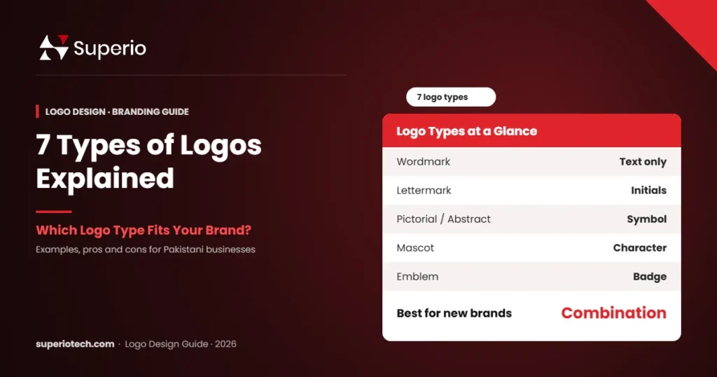
Want to explore more styles? Read about logo design trends in 2026 and the 7 main logo types. For costs, see our logo design price in Pakistan guide.
At SuperioTech, our professional logo design service focuses on simple, memorable logos that work everywhere.
Fonts for Minimalist Logo Design
In minimalist logo design, the font often does most of the work. So, choose it carefully.
| Font style | Feeling | Good for |
|---|---|---|
| Geometric sans-serif | Modern, clean, friendly | Tech, startups, apps |
| Humanist sans-serif | Warm, approachable | Clinics, schools, services |
| High-contrast serif | Elegant, premium | Fashion, jewellery, salons |
| Slab serif | Strong, reliable | Construction, logistics |
| Simple script | Personal, creative | Bakeries, boutiques |
Also, check font licences. Free fonts from Google Fonts are usually safe for commercial use. However, many fonts on random websites are not licensed for logos.
Negative Space in Minimalist Logo Design
Negative space is the empty area around and between shapes. In minimalist logo design, it can hide a second meaning. For example, the gap between two letters can form an arrow, or the inside of a letter can form a leaf.
These hidden details make a simple logo memorable. Moreover, people enjoy discovering them, which creates a small emotional connection with the brand. However, keep the idea natural. A forced hidden shape looks awkward.
Minimalist Logos and Urdu Lettering
Many Pakistani brands want both English and Urdu names. Minimalism still works here. For instance, a clean Urdu wordmark in a modern Nastaliq or Naskh style can look elegant and local. Then, pair it with a simple English wordmark underneath.
- Use one script as the main logo and the other as a secondary line.
- Match the visual weight of both scripts so neither looks too heavy.
- Test readability at small sizes, especially for Urdu letters with dots.
Minimalist Logo Design Process at SuperioTech
Here is how we usually approach a minimalist logo project. Every step focuses on removing anything unnecessary.
- Discovery: we learn about your business, audience and competitors.
- Keyword list: we choose three to five words that describe your brand.
- Sketching: we sketch dozens of rough ideas in black and white.
- Selection: we choose the three strongest ideas.
- Digital refinement: we perfect shapes, spacing and letterforms.
- Colour testing: we test one- and two-colour versions.
- Real-world mockups: we show the logo on signs, packaging and phones.
- Final files: we deliver every size and format, plus a short brand guide.
Keeping Minimalist Logo Design Consistent
A minimalist logo looks best when the rest of your branding is also clean. So, carry the same approach into your website, social media and packaging.
- Use the same one or two brand colours everywhere.
- Stick to one or two fonts across all materials.
- Leave plenty of white space in social posts and ads.
- Use simple icons that match your logo’s line style.
- Create templates in Canva so your team stays consistent.
Consistency builds recognition. In fact, a simple logo used consistently often beats a complex logo used carelessly.
Minimalist Logo Design Checklist
| Question | Pass? |
|---|---|
| Does it work in black and white? | Yes / No |
| Is it clear at 32 pixels? | Yes / No |
| Does it use two colours or fewer? | Yes / No |
| Does it use one main font? | Yes / No |
| Is there one clear idea? | Yes / No |
| Is it different from competitors? | Yes / No |
If you answer “yes” to every question, your minimalist logo design is ready. For sizes and file formats, read our logo size guide.
Conclusion
Minimalist logo design is about clarity, not emptiness. A simple, well-thought-out logo is easier to remember, cheaper to produce and works perfectly on phones, signs and packaging.
Focus on one strong idea, limit your colours and test at small sizes. If you want a clean, professional logo for your brand, SuperioTech can help.
Ready to Simplify Your Brand?
Book a Free Branding Session
Share your brand story, and we will suggest minimalist logo directions that fit your business.