
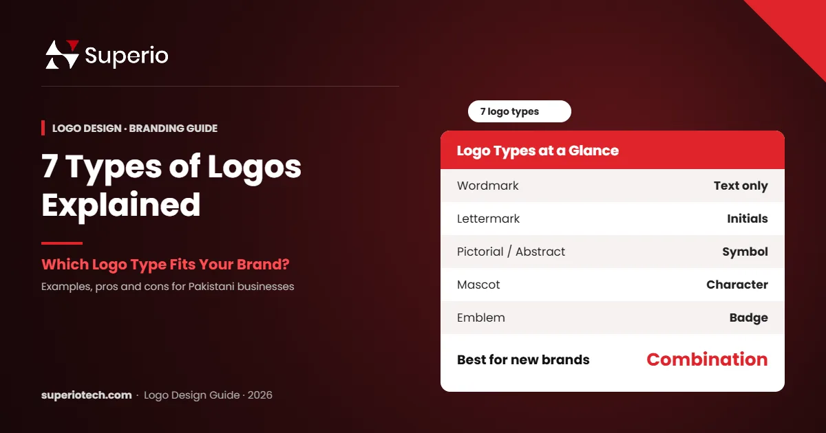
You have a business name, a shop or a startup idea. Now you need a logo. However, when you ask a designer, the first question is often confusing: “Which type of logo do you want?” Most business owners in Pakistan do not know the answer, so they end up with a logo that does not fit their brand. So, this guide on logo types gives you clear, practical answers.
This guide explains the 7 main logo types in plain words. In general, you will see real examples, the pros and cons of each, and which logo type suits your business, whether you run a restaurant in Lahore, a clinic in Karachi or a tech startup in Islamabad.
Table of Contents
- What Are the Main Logo Types?
- 1. Wordmark (Logotype)
- 2. Lettermark (Monogram)
- 3. Pictorial Mark (Brand Symbol)
- 4. Abstract Mark
- 5. Mascot Logo
- 6. Combination Mark
- 7. Emblem
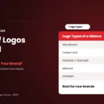
- Logo Types Compared at a Glance
- How to Choose the Right Logo Type for Your Business
- Best Logo Types by Industry in Pakistan
- Common Logo Mistakes to Avoid
- How Much Does Each Logo Type Cost?
- Logo Types and Colour: How They Work Together
- Logo Types for Online Brands vs Physical Shops
- How Logo Types Evolve as Brands Grow
- How to Brief a Designer About Logo Types
- Testing Your Logo Before You Finalise It
- Conclusion
What Are the Main Logo Types?
The main logo types are wordmarks, lettermarks, pictorial marks, abstract marks, mascots, combination marks and emblems. Each type uses text, a symbol or both in a different way. The right choice depends on your brand name, industry, budget and where your logo will appear most often.
In simple words, some logos say your name, some show a picture, and some do both. In addition, let us look at each one.
1. Wordmark (Logotype)
A wordmark is your brand name written in a special font. There is no icon. Instead, the typography does all the work. In general, global examples include Google and Coca-Cola. According to Wikipedia’s wordmark entry, wordmarks are text-only treatments of a company name.
- Best for: short, unique names that are easy to say.
- Pros: builds name recall quickly; simple to use.
- Cons: harder to make memorable with a long or common name.
For example, a fashion brand with a short Urdu-inspired name can look premium with a clean wordmark.
2. Lettermark (Monogram)
A lettermark uses the initials of a brand, such as HBL or PSO. It turns a long name into a short, neat mark.
- Best for: long company names and professional firms.
- Pros: compact; works well on small screens.
- Cons: new brands must also show the full name so people learn it.
3. In general, pictorial Mark (Brand Symbol)
A pictorial mark is a simple picture that stands for your brand, like the Apple apple or the Twitter bird. The icon is a real, recognisable object.
- Best for: established brands with strong recognition.
- Pros: works without words, even across languages.
- Cons: risky for new businesses because people do not know the name yet.
4. Abstract Mark
An abstract mark is a unique shape that does not show a real object. In general, the Pepsi circle and the Nike swoosh are famous examples. The shape creates a feeling, such as speed, trust or energy.
- Best for: tech companies and modern brands.
- Pros: fully unique and easy to trademark.
- Cons: needs marketing so people link the shape with your name.
5. Mascot Logo
A mascot is a friendly character that represents the brand. In addition, think of the KFC Colonel or a cartoon chef for a food brand.
- Best for: food brands, kids’ products, sports teams and gaming.
- Pros: fun, friendly and great for social media.
- Cons: detailed mascots can look messy at small sizes.
6. Combination Mark
A combination mark joins text with an icon, such as Burger King or Daraz. You can use them together or separately.
- Best for: almost every new business.
- Pros: builds both name and symbol recognition; very flexible.
- Cons: needs careful design so both parts work alone too.
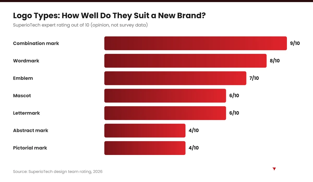
In our experience at SuperioTech, most new clients end up choosing a combination mark. It is simply the safest option for a brand that is still growing.
7. In fact, emblem
An emblem places text inside a shape, like a badge, seal or crest. Universities, police departments and coffee brands often use emblems.
- Best for: schools, cafés, government bodies and traditional brands.
- Pros: looks classic, official and trustworthy.
- Cons: fine detail can be hard to read on small screens.
Need a Logo That Fits Your Brand?
Get a Professional Logo From SuperioTech
We help you pick the right logo type and deliver full, icon and one-colour versions in all file formats.
Logo Types Compared at a Glance
| Logo type | Uses | Best for | Good for new brands? |
|---|---|---|---|
| Wordmark | Text only | Short, unique names | Yes |
| Lettermark | Initials | Long names, firms | Partly |
| Pictorial | Real icon | Known brands | Risky |
| Abstract | Unique shape | Tech, modern brands | Risky |
| Mascot | Character | Food, kids, gaming | Yes |
| Combination | Text + icon | Most businesses | Best choice |
| Emblem | Text in a badge | Schools, cafés | Yes |
How to Choose the Right Logo Type for Your Business
Choosing a logo type gets easier when you answer a few simple questions. So, work through these steps before you brief a designer.
- Check your name length. Short name? Try a wordmark. Long name? Consider a lettermark or combination mark.
- Think about where it will appear. If you mostly use Instagram and WhatsApp, you need an icon that works at small sizes.
- Look at your industry. Restaurants often suit mascots or emblems. Law firms and consultants usually suit lettermarks or wordmarks.
- Consider your budget. Mascots and custom illustrations usually cost more than simple wordmarks.
- Plan for growth. Pick a design that will still work if you open new branches or add products.
Best Logo Types by Industry in Pakistan
| Industry | Recommended logo type | Why |
|---|---|---|
| Restaurants and cafés | Mascot, emblem or combination | Friendly and memorable on signboards |
| Clothing brands | Wordmark or lettermark | Looks premium on tags and bags |
| Clinics and hospitals | Combination mark | Builds trust with a clear name |
| Tech startups | Abstract or combination | Modern and scalable for apps |
| Schools and colleges | Emblem | Feels official and traditional |
| Salons | Wordmark or monogram | Elegant and stylish |
Common Logo Mistakes to Avoid
- Too much detail: fine lines disappear on phone screens.
- Too many colours: stick to one to three brand colours.
- Trendy fonts only: trends fade, so choose fonts that will age well.
- Copying big brands: it can cause legal problems and confuses customers.
- Only one file: always get vector files (AI, SVG, PDF) plus PNG versions.
“Design is the silent ambassador of your brand.” — Paul Rand, graphic designer
How Much Does Each Logo Type Cost?
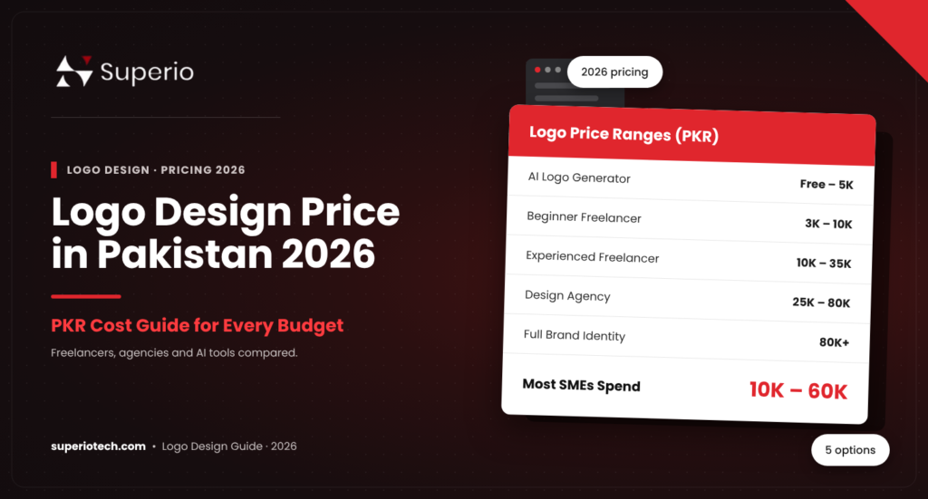
Simple wordmarks and lettermarks usually cost less. On the other hand, mascots, detailed emblems and full brand identities cost more because they need more design time. For full PKR ranges, read our logo design price in Pakistan guide. You can also check the latest logo design trends for 2026.
If you want a logo that fits your brand from day one, explore our professional logo design service. At SuperioTech, every logo comes with full, icon and one-colour versions.
Logo Types and Colour: How They Work Together
Choosing between logo types is only half the job. Colour also shapes how people feel about your brand. Therefore, think about type and colour together.
| Colour | Common feeling | Works well with |
|---|---|---|
| Red | Energy, passion, urgency | Mascots, combination marks for food brands |
| Blue | Trust, calm, professionalism | Lettermarks for clinics, banks and IT firms |
| Green | Health, growth, nature | Pictorial marks for organic and wellness brands |
| Black | Luxury, strength, simplicity | Wordmarks for fashion and premium brands |
| Gold | Prestige, celebration | Emblems and monograms for jewellery and events |
Also, remember that your logo must work in one colour. For example, stamps, embroidery and newspaper ads often print in black only. So, always test your chosen logo type in black and white.
Logo Types for Online Brands vs Physical Shops
Where your customers see you most should guide your choice. In our experience, online and offline businesses need slightly different priorities.
Online-First Brands
If you sell mainly through Instagram, TikTok or a website, your logo appears small most of the time. Therefore, a combination mark with a strong icon works best. You can use the icon alone for profile pictures and the full logo on your website.
Physical Shops and Restaurants
If customers see you on a signboard, readability from a distance matters most. As a result, bold wordmarks, emblems and mascots often work well. In fact, they are easy to light up at night and recognise from across the road.
B2B and Professional Services
Law firms, consultants and manufacturers usually need a calm, trustworthy look. So, lettermarks and clean wordmarks are a safe choice. They look good on letterheads, proposals and LinkedIn.
How Logo Types Evolve as Brands Grow
Many famous brands changed their logo type over time. At first, they used a combination mark so people could learn the name. Later, once the brand became well known, they dropped the text and used only the symbol.
This is a smart path for growing Pakistani businesses too. In fact, start with a combination mark. Then, after a few years of steady marketing, you may be able to use the icon on its own in many places. However, never rush this step; your audience must recognise the symbol first.
How to Brief a Designer About Logo Types
A clear brief saves time, money and frustration. Before you contact a designer, prepare these points:
- Business name and tagline: spell them exactly as you want them.
- Preferred logo type: for example, “combination mark” or “wordmark”.
- Three words for your brand: such as “modern, trusted, friendly”.
- Colours you like and dislike: include any brand colours you already use.
- Where the logo will appear: website, packaging, signboard or uniforms.
- Logos you admire: share examples, but do not ask for copies.
- Budget and timeline: be honest so the designer can plan.
With this brief, a good designer can quickly suggest the right logo types and show relevant concepts.
Testing Your Logo Before You Finalise It
Do not approve a logo after seeing it only on a white screen. Instead, test it in real situations:
- Shrink it to a 32-pixel favicon and check it is still clear.
- Place it on a dark background and a busy photo.
- Print it in black and white on normal paper.
- Mock it up on a shop sign, business card and Instagram profile.
- Show it to five real customers and ask what it makes them feel.
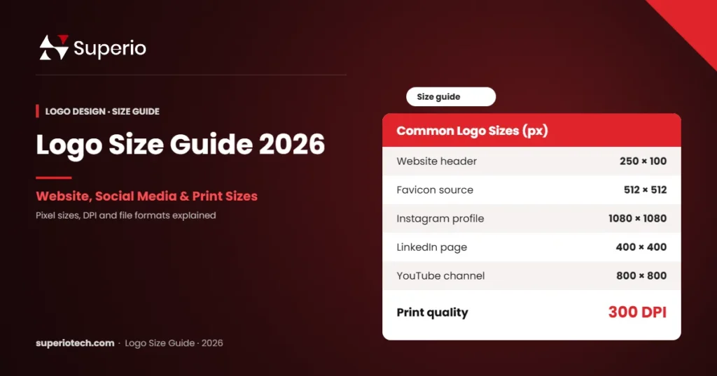
If the logo passes these tests, you have chosen the right logo type. For help with sizes and files, see our logo size guide and our tips on minimalist logo design.
Conclusion
Understanding logo types helps you brief designers clearly and avoid costly redesigns. In fact, wordmarks suit short names, lettermarks suit long names, and combination marks suit almost every new business. Meanwhile, mascots and emblems work well for food, education and traditional brands.
Above all, choose a logo that stays clear on a small phone screen. If you want expert help, SuperioTech can design a logo that fits your brand and budget.
Ready for a Logo That Lasts?
Book a Free Branding Session
Tell us about your business, and we will suggest the right logo type and package for your budget.