
Your customers decide whether to trust your brand in seconds. In that short time, your logo does most of the talking. So what is it saying in 2026?
Logo design is changing fast. Brands now show up on mobile apps, TikTok videos, WhatsApp chats, delivery boxes and shop signboards, often all in the same day. A logo has to work everywhere. In this guide, we cover the 10 biggest logo design trends 2026 and explain which ones suit businesses in Pakistan.
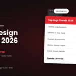
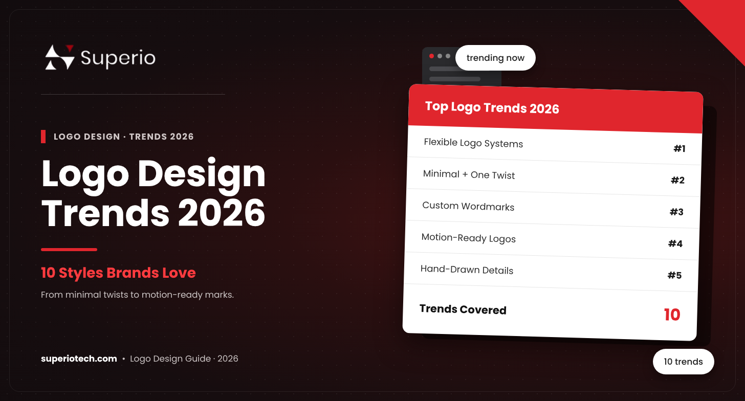
The 10 Biggest Logo Design Trends 2026
1. Logos as flexible systems
A logo is no longer one fixed image. Brands now build a logo system: a main logo, a short version, an icon and a favicon. Each one fits a different screen or space. This is essential for brands that run social media, apps and print at once.
Pakistan tip: Make sure your logo has a square icon version for your WhatsApp Business and Instagram profWhy Logo Trends Matter (and When to Ignore Them)
Trends show you what feels fresh to customers right now. They help a new brand look current and a dated brand look renewed.
But chasing every trend is a mistake. A logo should last 5–10 years. The smart approach is to use trends as inspiration while keeping your core design simple and timeless.
“Design is thinking made visual.” — Saul Bass
ile picture.
2. Minimal logos with a simple twist
Clean, minimal logos are still everywhere. The 2026 version adds one memorable detail, like a negative-space cut, a chamfered corner or a slightly tilted letter. This small “twist” makes a simple mark easy to remember.
3. Typography doing the heavy lifting
More brands are choosing custom wordmarks instead of icons. Unique letter shapes carry the brand’s personality. This works well for brands with short, catchy names.
4. Warm, “toasty” logos
Rounded letters, soft curves and earthy colors are popular. These logos feel friendly and handmade. They are a great fit for cafes, bakeries, home brands and skincare businesses.
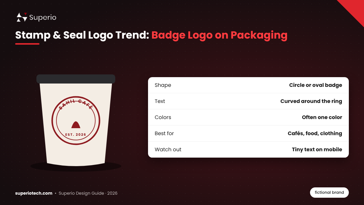
5. Stamp and seal badges
Circular badges with ringed borders and curved text are back. Inspired by postmarks and travel stamps, they suggest heritage and quality. They work well on packaging, labels and merchandise.
6. Motion-ready logos
More logos are designed with animation in mind from day one. The logo might bounce, stretch or reveal itself in a video intro. With video platforms driving reach in Pakistan, a logo that animates well gives your content a professional edge.
7. Hand-drawn and imperfect details
As AI-generated design becomes common, people want something that feels human. Hand-drawn lines and small imperfections add warmth and authenticity.
8. Freehand mascots
Simple brand characters with bold shapes and two or three flat colors are trending. Mascots work great for food brands, kids’ products and apps. They also make social media content more fun.
9. Fewer colors that do real work
Brands are cutting down their color palettes. Instead of five colors, they choose one or two strong ones that customers instantly connect with the brand. Gradients are still used, but carefully.
10. Soft gradients and atmospheric shapes
Calm pastel gradients and flowing, cloud-like shapes are popular with tech, wellness and lifestyle brands. They feel modern and calm without being loud.
Trend Fit Guide for Pakistani Businesses
| Trend | Best for | Watch out for |
|---|---|---|
| Logo systems | Every growing brand | Keep all versions consistent |
| Minimal with a twist | Tech, consulting, real estate | Twist must stay readable |
| Custom wordmark | Short brand names | Long names get cramped |
| Warm “toasty” style | Food, cafes, home brands | Can feel too casual for B2B |
| Stamp and seal | Packaging, clothing, food | Small text can blur on mobile |
| Motion-ready | Brands active on TikTok and Reels | Static version must still work |
| Hand-drawn details | Boutiques, artisans, NGOs | Can look messy if overdone |
| Freehand mascots | Food, kids, apps | Needs consistent illustration |
| Fewer colors | Every industry | Check contrast on dark modes |
| Soft gradients | Tech, wellness, beauty | Gradients can print poorly |
How to Use Logo Trends Without Dating Your Brand
- Start with your brand story. Pick a trend only if it matches what your brand stands for.
- Keep the core simple. A trend should be one layer, not the whole design.
- Test it small. Your logo must be clear at 32 pixels, as a favicon or app icon.
- Test it in black and white. If it works in one color, it will work anywhere.
- Plan your variations. Design horizontal, stacked and icon versions together.
Not sure how to plan this? Our step-by-step guide on how to design a logo walks through the full process.
Trends That Are Fading in 2026
Some styles are losing their appeal:
- Overly complex 3D logos that do not shrink well
- Generic swoosh and globe icons that look like templates
- Too many colors that make printing expensive
- Copy-paste AI logos that look like every other brand
If your current logo uses any of these, a refresh may help. Curious whether AI tools can do the job? Read AI logo generator vs designer.
What This Means for Your Budget
Trendy logo systems and motion-ready logos take more design time than a single static logo. That affects price. Check our logo design price in Pakistan guide to plan your budget.
Conclusion
The best logo design trends 2026 share one idea: logos must be simple, flexible and human. Use trends to inspire your design, not to control it. A logo that is clear, scalable and true to your brand will always beat a logo that just follows the crowd.
Want a logo that looks modern and lasts for years? Explore SuperioTech’s professional logo design services.
Ready for a Modern Logo? Our designers blend the latest trends with timeless design, so your logo looks fresh today and still works years from now.
Give Your Brand a 2026-Ready Logo with SuperioTech
About the Author
Faizan Irfan is the CEO of SuperioTech, a digital marketing agency in Karachi, Pakistan. He works with businesses on branding, design, SEO and digital growth, helping them build brands that customers trust.